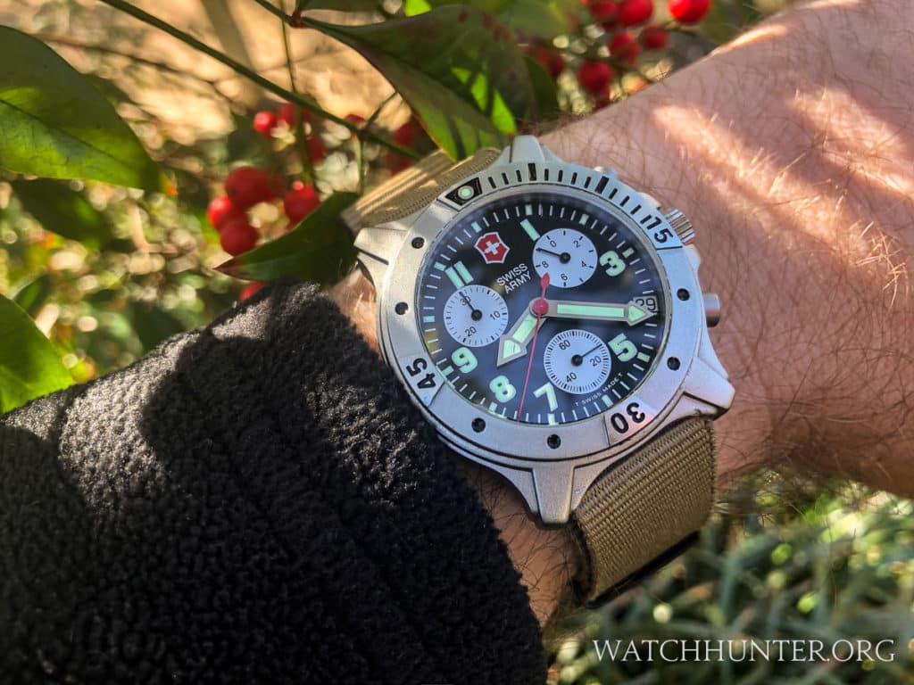
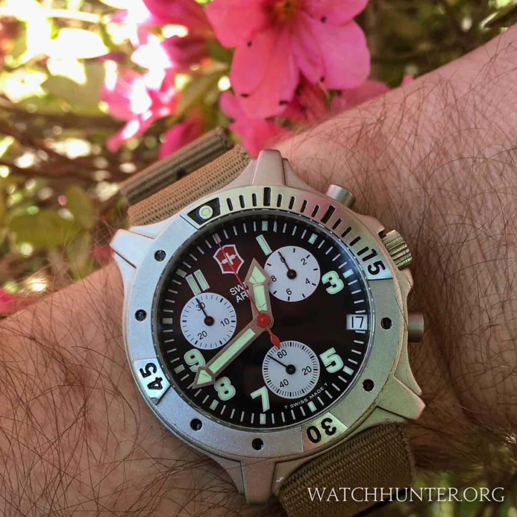
Historically speaking, aluminum is not usually the first material that is chosen to make wristwatches, but Victorinox Swiss Army picked this alloy for their series of Centurion watches. Both the use of this metal and the design of these quartz wristwatches might be considered unusual, but beauty is often in the eye of the beholder. Let’s take a look back in time at the Victorinox Swiss Army Centurion Chronograph as an example of a Swiss watch company thinking outside of the box.
An Unusual Watch Case Material
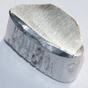
Aluminum is a naturally occurring element and it supposedly makes up about 8.8% of the Earth’s crust. It is the second most used building material today after iron. You probably come in contact with aluminum every day of your life. From the cans of sodas that you drink to the car you drive, aluminum is used everywhere in our modern world. However, before Charles Martin Hall invented a way to extract pure aluminum in 1886, this element was considered a precious material. Find out additional aluminum facts at Enclycopedia.com
Nowadays, aluminum is ubiquitous and just considered a building block. It can be combined with different materials to create interesting alloys with different properties. I have no way of knowing which aluminum alloy is used in the Victorinox Swiss Army Centurion Chronograph. What matters for more to watch collectors is the appearance, feel and weight of the Centurion’s aluminum case… and this model is a quirky gem!
Victorinox Swiss Army has a brief history of using aluminum on their watches. This material is not what would be considered high-end so it appeared on their sports lines. These were not expensive watches, and perhaps that is what these materials were used for such product lines as the Centurion and StarTech. I would argue that the unique aesthetics of the semi-crystalline metal was another reason.
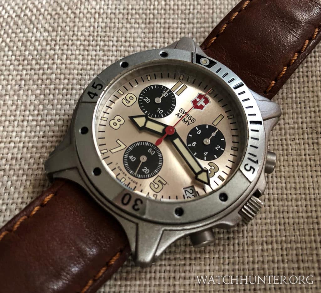
The texture of the Swiss Army Centurion Chronograph is best described as bead blasted. It would be similar to the look of the aluminum used in engine blocks, but much smoother because any irregularities have been milled away. The aluminum surface reflects lights as a soft sheen, and there are only a few polished surfaces to be found on the watch including the stainless steel crown and some raised parts of the diver’s bezel. The way that light plays over the complex surfaces is satisfying because every curve, edge, and step can be seen in great detail. It is a lighter silver color than titanium but not as bright as steel. Even in harsh sunlight, there are no blinding reflections to the eye to obscure the details (though this watch is the devil to photograph).
A Family Resemblance
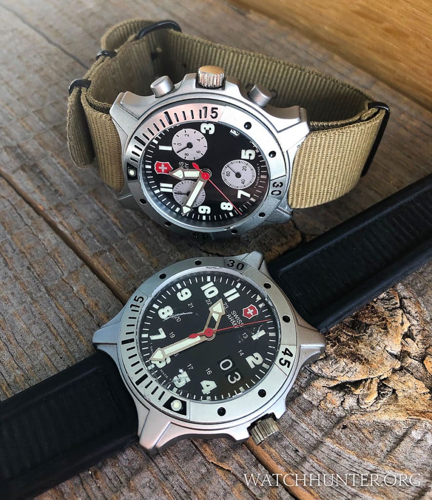
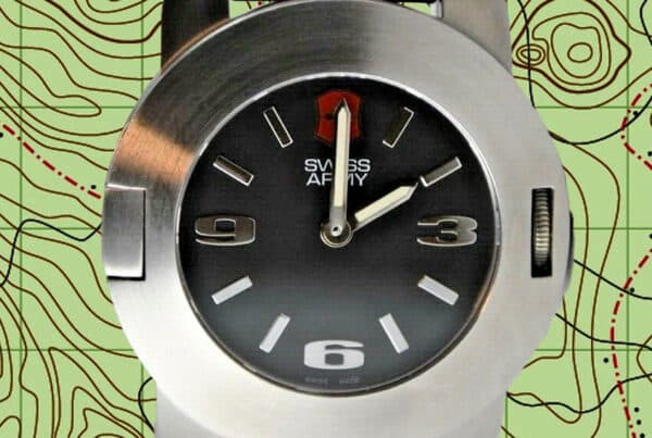
Victorinox Swiss Army had a small collection of Centurion watches that used the same general case design and materials. I wrote a previous article called MEET THE WATCH: Victorinox Swiss Army Centurion “Big Date” that explored the 3-hand watch seen below with a BIG DATE complication that uses two date disks in tandem to show a date larger than what just one date disk could.
A Lightweight Case
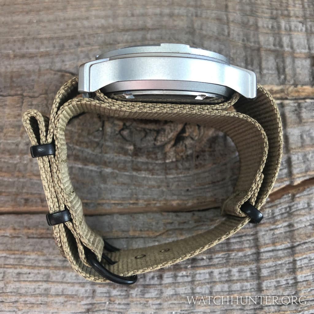
Aluminum is a lightweight metal when compared to stainless steel, which is about 2.5 times denser. The Swiss Army Centurion Chrono is light with the watch head weighing only 40 grams. You barely feel it on the wrist. A smaller form factor contributes to the wearability as well. The watch is only 13 mm tall. The Centurion Chrono is 42.25 mm including the crown and has an amazingly slim lug-to-lug distance of 43.5. That makes the proportions of this watch almost exactly square. This is one factor that gives the watch its unique look. People who love modestly-sized quartz watches should consider owning a Centurion if they like the funky style.
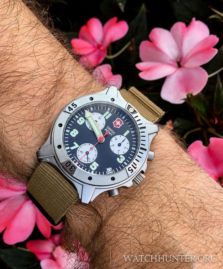
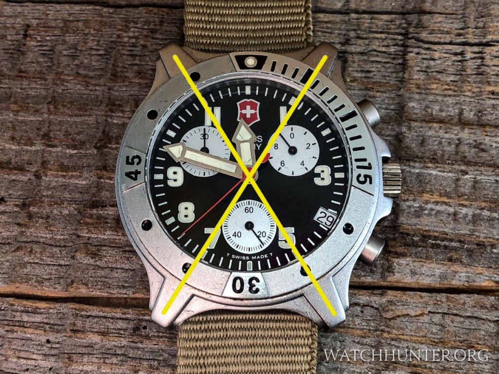
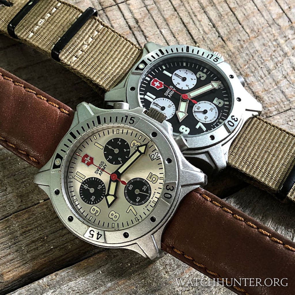
Many watches have so-called cross-hair dials with lines that go from 3 to 9 and 12 to 6 intersecting to make a “+” shape. The Swiss Army Centurion Chrono riffs on that idea in a different way by rotating the lines. The “X” shape is not on the dial but created in 3-dimensions with ridges located on the stubby lugs. The imaginary “X” crosses from 1 to 7 and from 11 to 5. This is an interesting twist to an old idea because these lines cross between the subdials, touching the edges diagonally. Even if we do not see actual lines, our brains can notice the relationship between the parts of the watch. It brings unity to the dial and case and in a satisfying way.
I’m not sure that I have the exact words to describe the design of the case, but I will give it a try. Its general shape from above is round with stubby lugs that barely protrude from the case. and it has semi-attached lugs that have two levels. I’d call these “steps”. It looks like the case was stamped or milled in such a way that there is a lower step of the case and an upper level of stylistic embellishment in the shape of the “X” mentioned earlier.
The edges of the case at 12:00 and 6:00 partially cover the attached watchband, which almost qualifies this lug design as shrouded. As such, there is absolutely no space seen between the strap and case. I like this design since it eliminates unsightly gaps between the watchband and the case that many watches have. This is a more streamlined look that was popular in the 1970s.
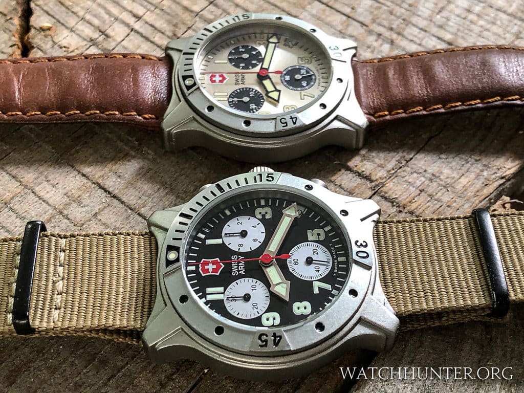
I am not 100% sure of all of the strap options originally offered for the Swiss Army Centurion Chronos. My Champagne dial watch came with a brown leather 2-piece strap with orangey threads and a signed buckle. My black dial watch came with a black leather strap that included a fold-over leather feature near the lugs end. This style was sometimes used on Swiss Army’s other watches like the Cavalry. I would suspect that rubber straps as seen on other Centurions were an option too, but I cannot find historical evidence to support that.
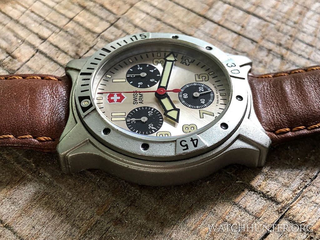
The side view of the Swiss Army Centurion Chrono shows stubby lugs that curve down to make a tighter connection with the wearer’s wrist. The mid-case is strongly delineated and with steps instead of facets or smooth curves. This linear treatment mirrors the decoration on the top of the lugs. The lower part of the case tapers to make the watch feel smaller on the wrist. You can see that the bezel does not have any type of texture on the sides so manipulating the bezel is done by applying pressure from above while turning it.
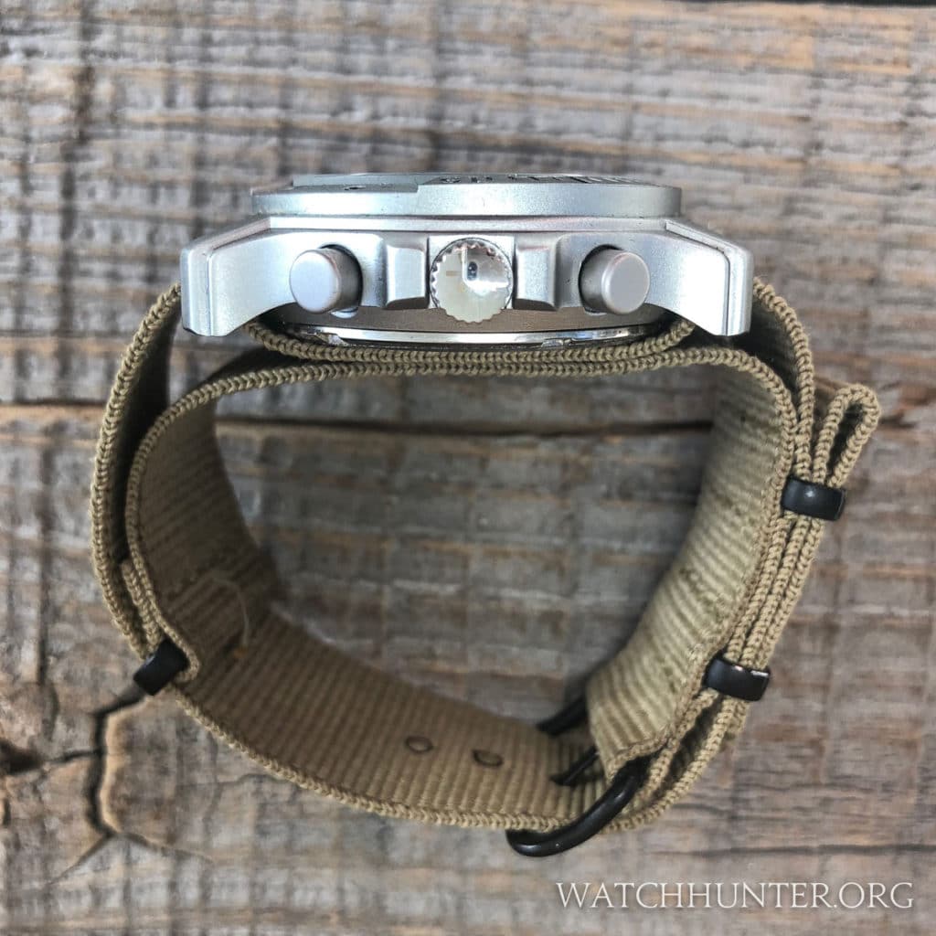
The other side has the crown and pushers. Integrated crown guards were added to protect the crown from being sheared from the watch (a common issue for early wristwatches). The pushers have the same bead blasted appearance as the case, but the unsigned crown is rendered in mirror-like, polished stainless steel. Steel is harder than aluminum and it was likely used here because it would make a safer material in the crown assembly. Crowns are generally made from a cap, shaft, gaskets, and a spring. I would wager that stainless steel is easier to use with predictable results and better durability.
The Aluminum Bezel
The Swiss Army Centurion Chrono sports a 120-click unidirectional diver style bezel. It is also made from the same aluminum, and mostly finished with a smooth bead blasted finish. The bezel is multi-level as well with key sections standing higher than other parts including 0-15 minutes, 30-minutes and 45-minutes. The higher sections are polished and reflect more light than the bead-blasted components. The bezel is engraved with dots, hash lines, and Arabic numerals. The engravings are filled will shiny black enamel paint. This bezel can be read in almost any normal light. A small lume pip at the zero position helps the wearer orient the bezel position in the dark.
The action for the bezel is somewhat curious. There is no texture to grip on the edges of the bezel, and the edges are extremely smooth. There is no bezel overhang either because the bezel is smaller than the case. I found myself using my fingers to push against the bezel from above. Using this technique made the bezel move freely.
The Dial
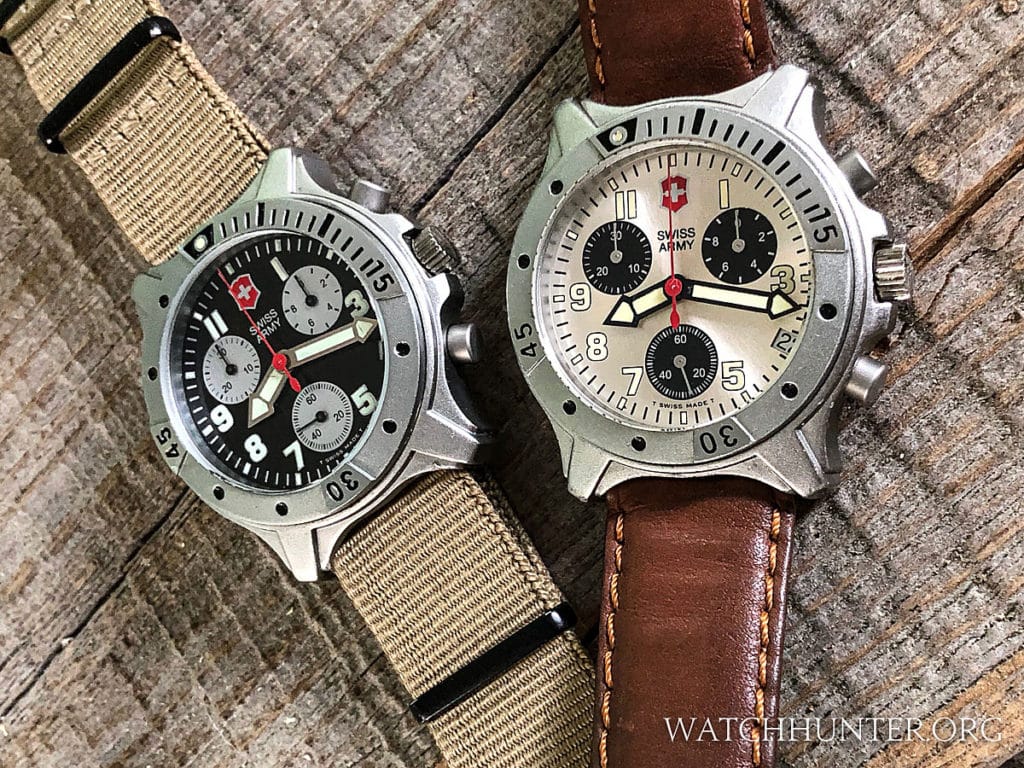
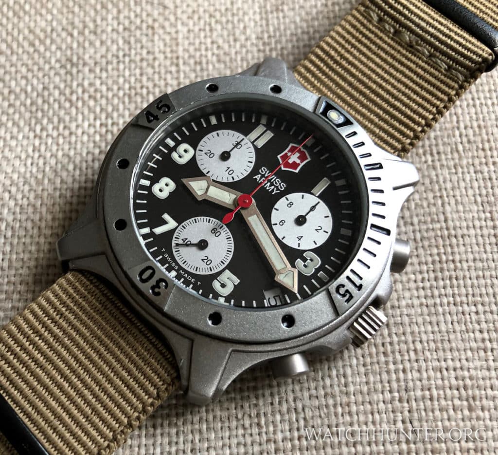
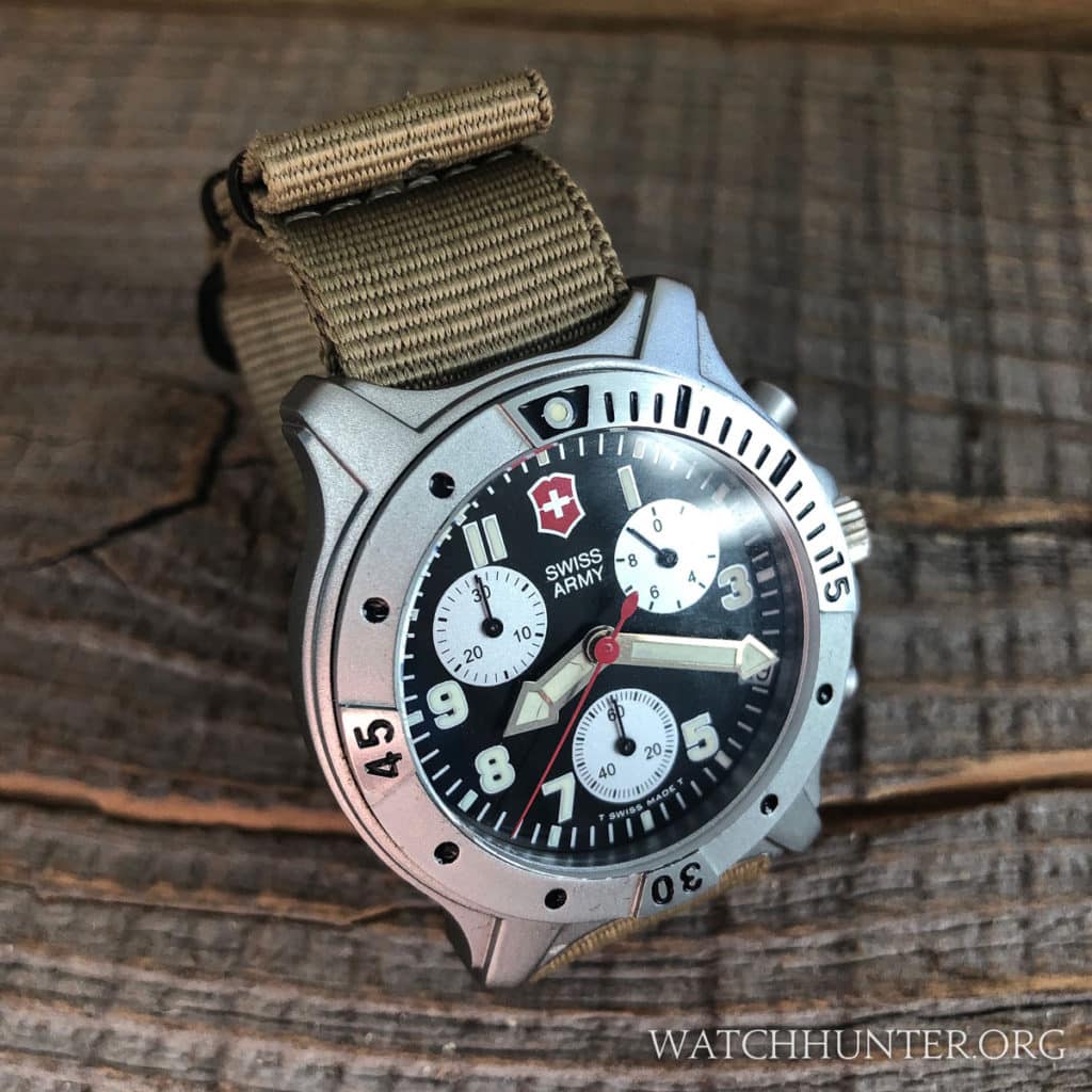
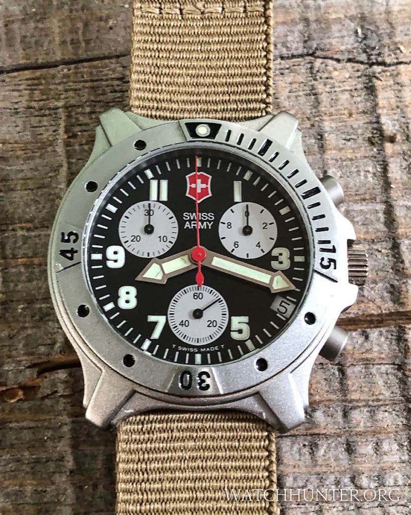
The dial of the Swiss Army Centurion Chrono is as bold as the case. The subdials were designed for maximum contrast against the background dial color. The black dial gets silvery white subdials and the champagne sunburst dial gets black subdials. The subdials do not contain engraved snailing texture as some Swiss Army watches. In fact, the whole dial is a single, flat layer. Whatever contrast is achieved is done strictly with different colors. The familiar SWISS ARMY shield logo appears at the 12:00 position. Most of the numerals remain intact, but the 2,4,6 and 10 have been removed to make room for the subdials. Of the two dial options, the black version below definitely has more contrast so it would be easier to read.
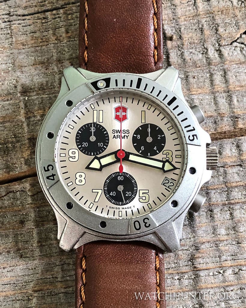
The date window is located at the 4:00 position, which always seems to be controversial to watch collectors who insist on perfect symmetry or would prefer to have no date at all. However, having a date was considered a major selling point for these older watches that were on sale before everyone had a cell phone (or maybe even an iPod). Attitudes were different back then so keep that in mind when judging older watches. Notice that the date wheel on the black dial is white and acts as a visual marker in lieu of the number 4. The date wheel on the Champagne dial is also white but it tends to blend in more subtly.
Below you can see that the Champagne dial has a subtle sunburst effect and that the light numerals were rimmed in black for improved legibility. This lighter version could be considered the dressier of the two options, but these watches are not intended to ever be paired with a suit or dress shirt. These are sports watches with a slight tool watch style.
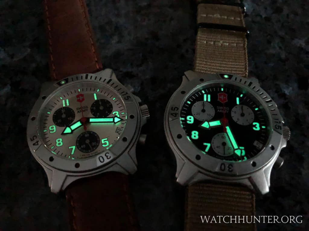
The hands and Arabic numerals still come alive in the dark, though not as strong as the photo below would have you believe. The luminescent material used on the Swiss Army Centurion Chrono is Tritium, which is mildly radioactive. This compound is considered fairly safe, but it is now out of favor in the watch industry. The replacement called Superluminova is an inert compound that has provided the “glow” on watches since the early 2000s (give or take). One way to know that you have an older Swiss Army watch is to determine if it has Tritium lume. If so, the watch will usually be marked the T SWISS MADE T” on the lower part of the dial. Over time, Tritium will age into a beautiful creamy color that can range from eggnog to pumpkin shades. Discriminating watch collectors will wax poetically about this sort of thing for hours. haha
The Hands
The hands of the Swiss Army Centurion Chrono might be described as blocky arrows with two sections. This not only looks interesting, but the smaller expanses of lume are less fragile than one a single big one. Ironically, the lume on my black dial Centurion Chrono is cracked, but that can happen no matter what. These Swiss Army Centurion Chronos are likely from the 1990s so they can be classified as vintage Swiss Army watches.
Swiss Army designers used contrasting colors for the hands with bright silver on the black dial and black on the champagne dial. If you look closely you will see that the hour and minute hands are different widths with the hour hand appearing wider.
The Centurion family of watches was not a very large one, but there were several members including digital-analog versions and some time-only watches. The Swiss Army Centurion Chronos are the best of the designs by far. I was lucky to pick up both models for my time-capsule of early Swiss Army watches. Do you think that Victorinox will ever have a watch museum? I guess I will eventually have one if they don’t. haha


