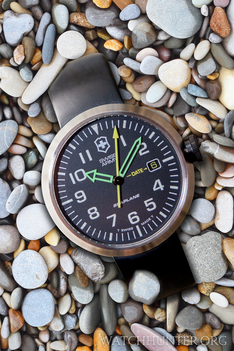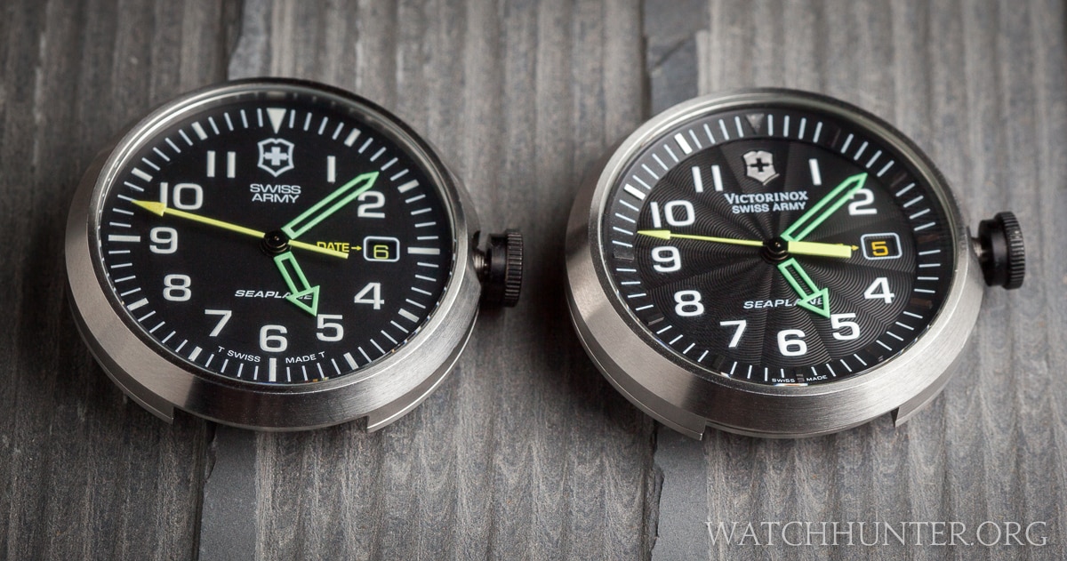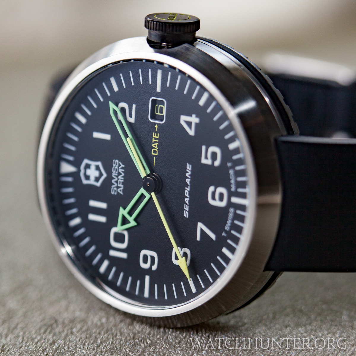
The earliest Swiss Army SeaPlane watches had a flat dial printed with Tritium markers and neon hands
The first version of the Swiss Army Seaplane watch, which I will call the Tritium SeaPlane, set the tone for the 4 series that would follow. Seaplanes were marketed under their Swiss Airforce line, which has ties to aviation. But, these are not really pilots watches so Swiss Army designers channeled a simple sport watch with hints of a pilot watch’s aesthetics. Specifically, the dial was graphically simple and easy to read at a glance. This watch looks like a time-capsule design from the late 1990’s to the early 2000’s. Remember those neon clothes?
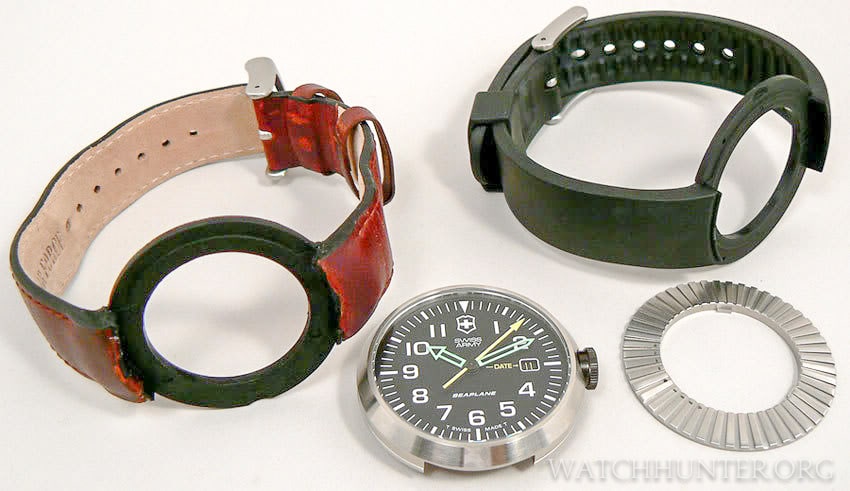
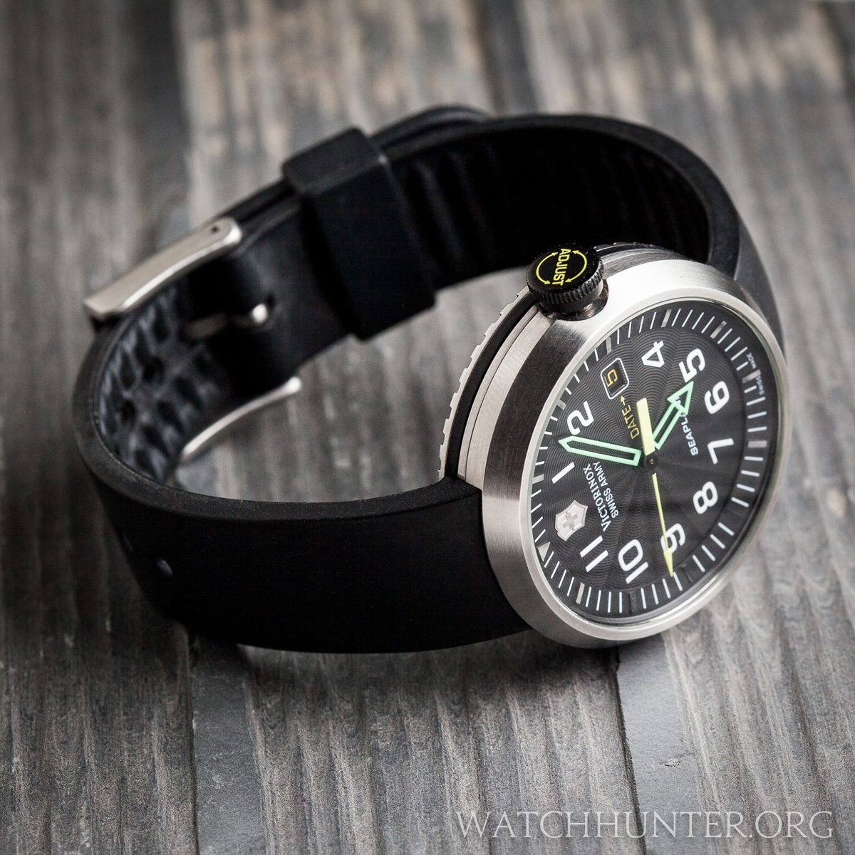
The parts that make up a Swiss Army SeaPlane watch are the proprietary watch bands, watch case (head) and locking ring
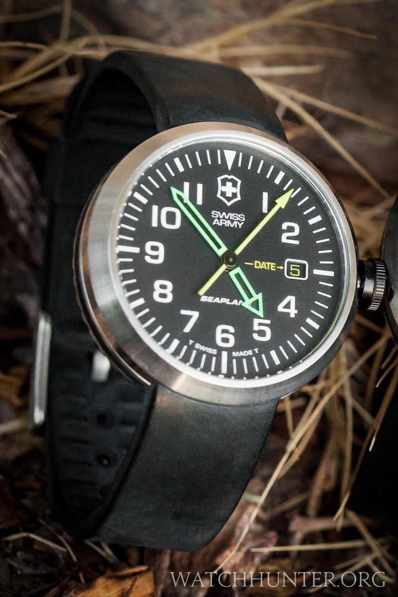
One theme on SeaPlane watches is the repeated use of arrows. There are no fewer than 7 arrows on each watch, even though the minute’s hand could technically be considered a sword. The use of neon green skeleton hands and a yellow seconds hand were signature touches that were reiterated in later models. A large screw-down crown, sloping puck-shaped case, and a lugless quick-change watchband system rounded out the design parameters. Owners could turn a donut-shaped disk on the back of the watch to lock and unlock the wristbands to swap between leather, rubber or metal bracelet options.
I believe that visual simplicity was the goal of this watch. Swiss Army used basic shapes like triangles, circles, and rectangles with little embellishment. On the dial, two thicknesses of tick marks and inset wide numerals were used. The 3:00 numeral is replaced by a date window with a white outline. The date wheel has custom yellow numbers on a black field… a nice touch, that could have easily been overlooked. The shield logo and SEAPLANE are also printed in a flat white paint. The dial is markedly flat compared to 3-dimensional designs of later models.
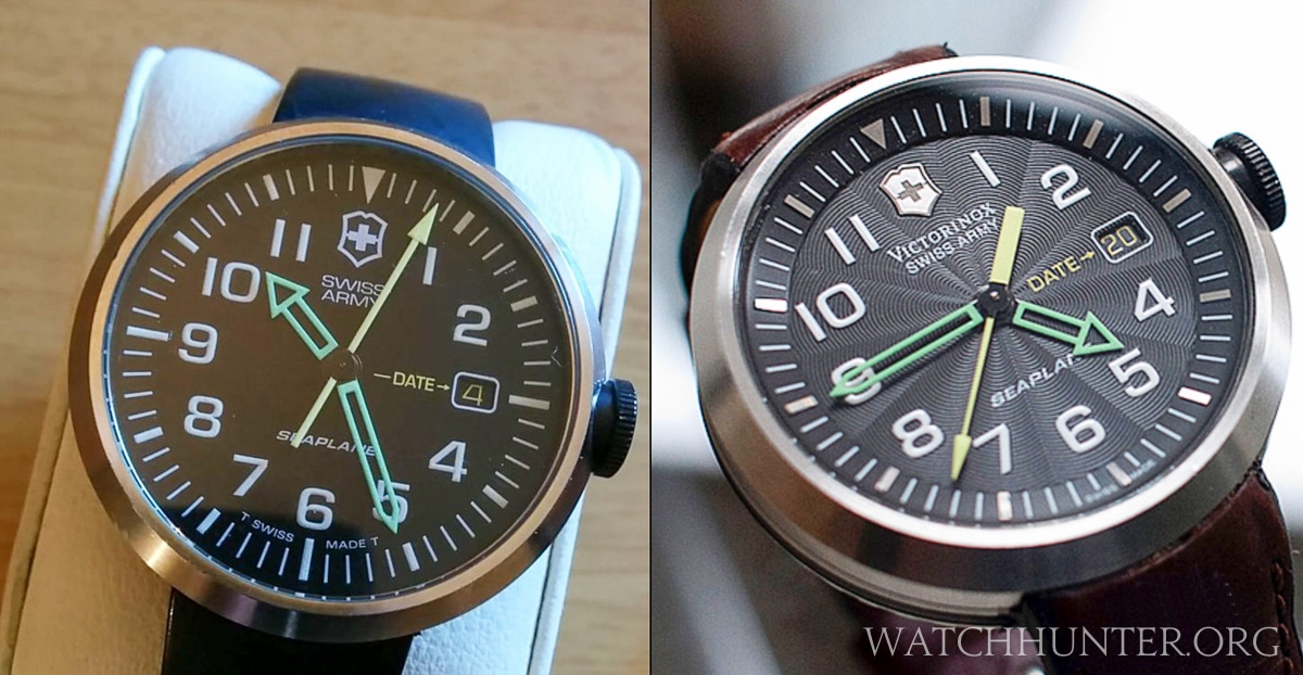
The main hands are green and skeletonized. The hour hand is literally a rectangle with an isosceles triangle perched on top… kinda like the way a child might draw a tall house (see below). All that is missing is a chimney. All kidding aside, there is beauty in simple geometry like this. The ticking second’s hand is a stick arrow with no taper and the counterweight seems to perfectly fit into the negative space of the hour hand. This is not an accident and Swiss Army delivered a deceptively simple watch free of visual clutter. It could be argued that it is too simple, but that is a matter of taste.
The text at 6:00 reads “T SWISS MADE T,” which means that slightly radioactive Tritium paint was used to print the dial. Over time, the glow of Tritium diminishes due to its half-life, that is it loses half its initial strength in just 12.3 years. In 24.6 years, it should be 1/4 of its original strength and so on. This watch still faintly glows, but eventually, it will be undetectable in the dark.
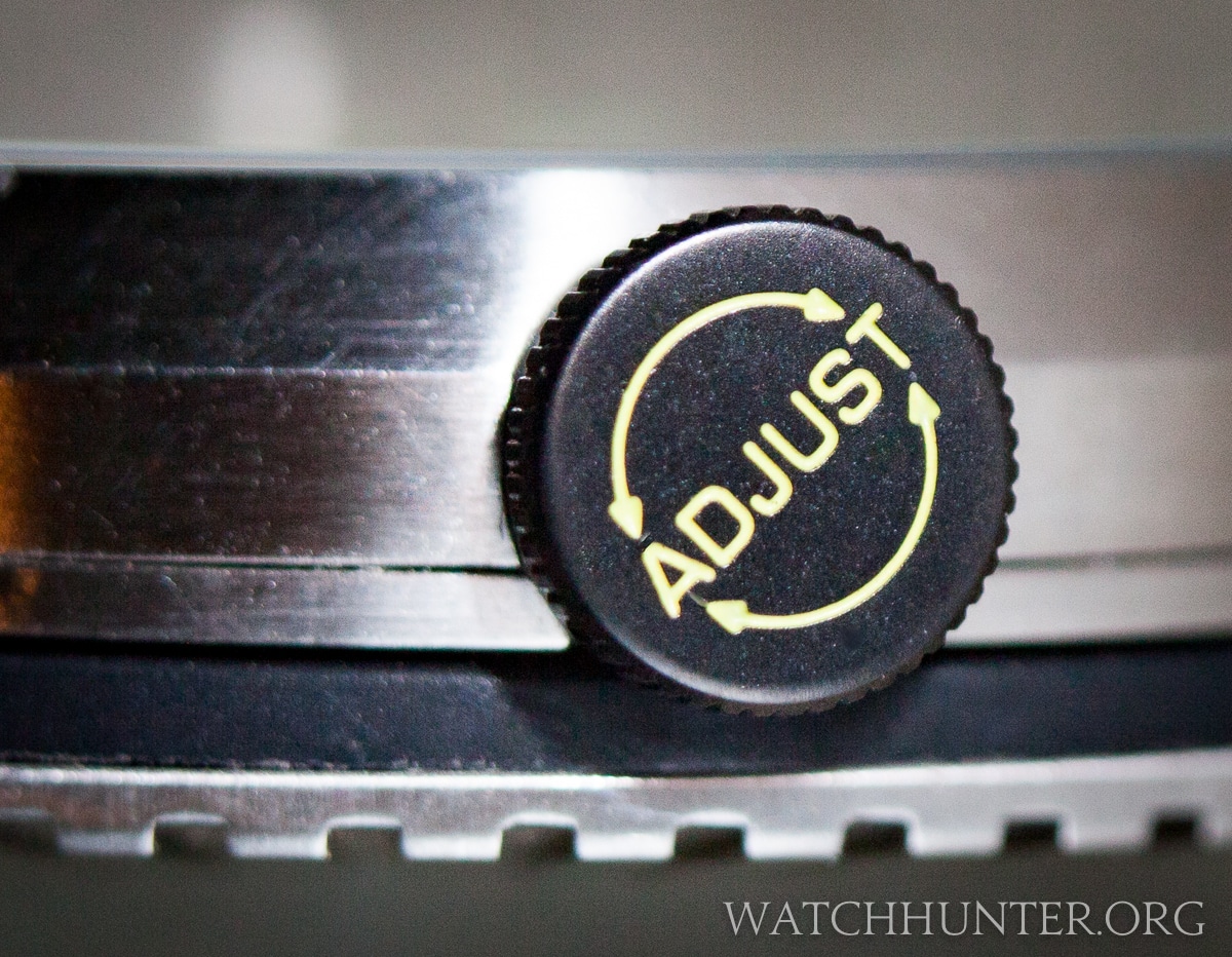
The screw down crown on the SeaPlanes prevent moisture from entering the case, and they have “ADJUST” printed on them. Two more arrows can be found here, and one more on the back. See what I mean. Some good advice is: don’t pull the crown too hard, or you might pull it right off.
Version 2 was a Dimensional Refinement of the Tritium SeaPlane
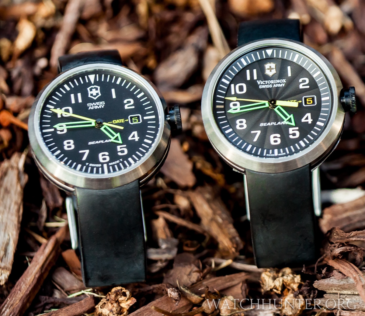
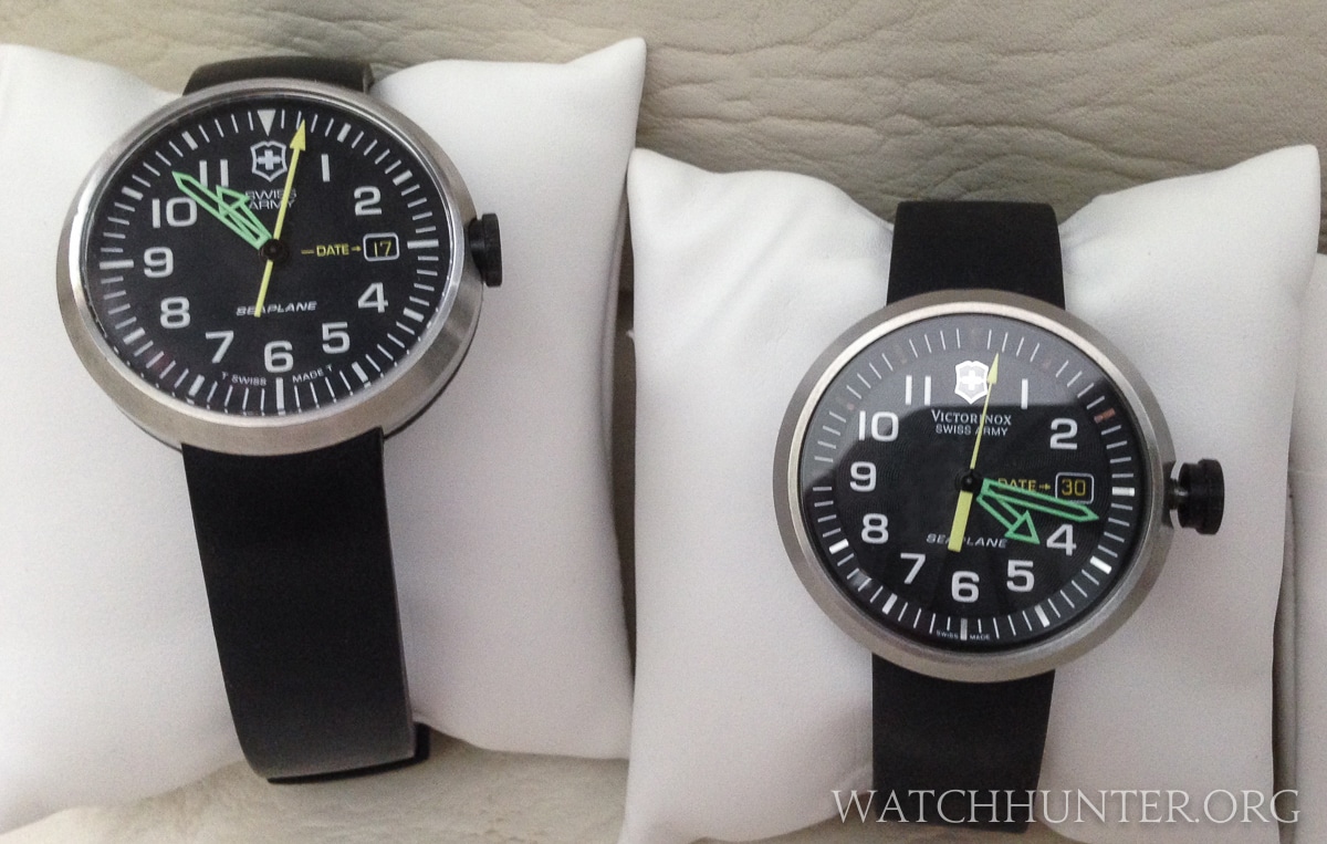
After 2002, Swiss Army incorporated “Victorinox” into its logo, and it finally had worldwide control of the Swiss Army name. Before then, another company held rights to the name in the United States. That is the first thing one might notice when comparing version 1 and 2 of the SeaPlane watches, but the changes go much deeper than that because almost every single part of the dial was altered. Only the green hands and numerals remained the same. See if you can pick out all the differences below.
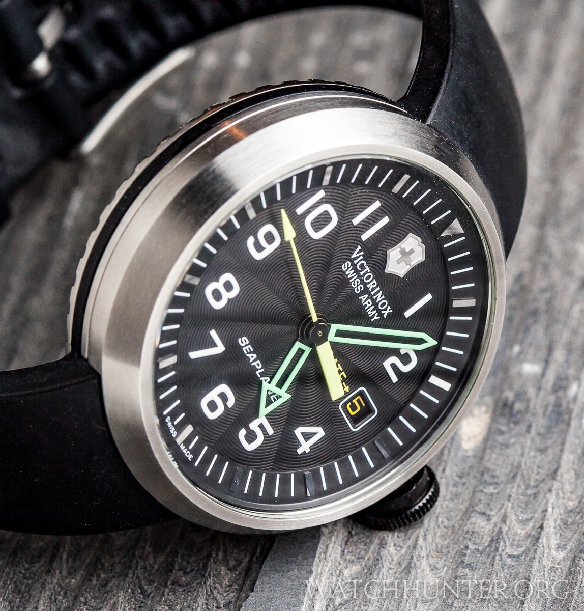
Still, can’t find them all? Try this angle that shows the enhancements better.
The attention to detail is pretty good for a mass produced watch. You see the evolution of the design by comparing each new part with its predecessor.
- Dial Dimensionality: A 1-layer dial was replaced with a 2-layer dial.
- Logo: Besides the name change, an applied metal shield gives 12:00 more pop.
- Chapter Ring: The flat printed indices were changed to dimensional applied metal indices on a sloped chapter ring.
- Yellow Seconds Hand: This ticking hand transformed from a simple stick arrow to a tapered arrow shaft with a thick counterweight on the end. I like to imagine that they look like feathers on a real arrow.
- Date Window: The arrow near the DATE word was simplified.
- Dial Texture: A guilloche texture was added to the dial surface that looks like a spider web pattern emanating from the center. One cannot always see the effect, but it is lovely when you can.
These changes did have some effect on the legibility of the watch, especially because the indices went from glowing paint to polished stainless steel. Metal tick marks are readable in many lighting situations, but as soon as the lights go down, they become hard to see. However, it looks great in the bright light.
Below, you can see the majority of the faded Tritium paint indices compared to the stainless steel indices that only show when the light hits it perfectly. The applied illumination pattern for both generations’ hands remained the same though Tritium would have been replaced with Superluminova or its equivalent.
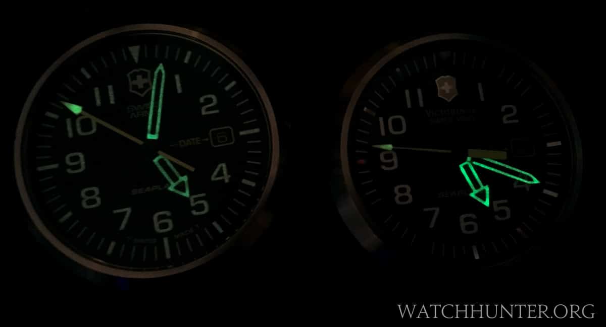
The first generation Seaplane on left with Tritium indices versus the second generation SeaPlane with metal indices.
The rest of the changes are welcome refinements that move the watch away from a pilot-inspired watch to maybe a sporty watch that is a bit dressier, and more visually complex. Swiss Army hit upon this combination of features and stayed consistent with them for future models to come. Stay tuned for more SeaPlane coverage in coming posts.
But before I let you go, I have to confess that the flat Tritium version of the SeaPlane threw me for a loop when I first discovered it. I was convinced that it was a counterfeit since it did not have all the added visual upgrades of the later models. I was so sure of this, that I sent a detailed comparison to Swiss Army for them to confirm that it was a fake… and it was not. Oops. In my defense, the evolution from a flat watch to a dimensional watch was so drastic that I would have bet money on it. Good thing I did not.


