The Alpnach series of watches by Victorinox Swiss Army was a bit of an acquired taste for me, but once I accepted the design aesthetic, I was hooked. Some people have a real problem with the dial design, but we will get to that later.
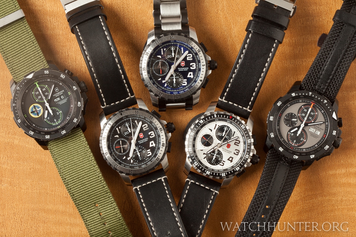
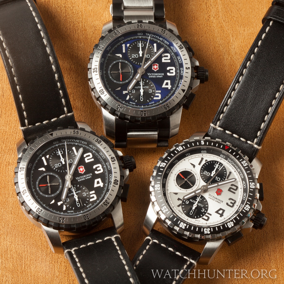
I had all of these first and second generation Alpnachs for a single moment in time before the “squadron” split up
Alpnach is an airport smack dab in the middle of Switzerland. You can take a Google tour by hitting that link. It looks like it would be a great place to land a private airplane with its scenic mountain views.
According to Wikipedia, “Air Base Alpnach is the main logistical base of the helicopter of the Swiss Air Force.” With a crowded arena of watches named after airplanes, it is nice to see other types of aircraft represented. All of the automatic versions of this product line feature a stylized helicopter rotor on the 9 o’clock subdial with a single red rotor. Cool!
Swiss Army says that the design cues for the watch were inspired by the Eurocopter AS532 Cougar which flies from Airbase Alphnach. I want a ride in that whirlybird.

The inspiration for the 4-blade rotor on the dial of the watches is the Eurocopter Cougar of the Swiss Air Force. Photo: Wikipedia
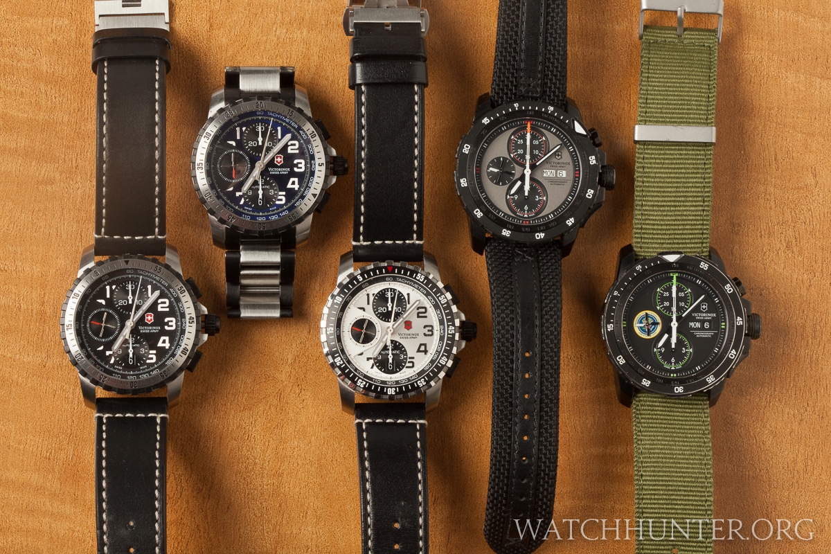
There are currently two generations of the Alpnach automatic watches with many sub groups. I will be focusing on the chronographs since that is what I am most interested in. Swiss Army smartly designed this series realizing that they could use the same base watch design and make a score of color and finishing changes to create a visually varied and stunning collection. The watches below are somewhat similar but different enough to be distinctive and desirable. Perhaps it saves on manufacturing costs to have a scalable design.
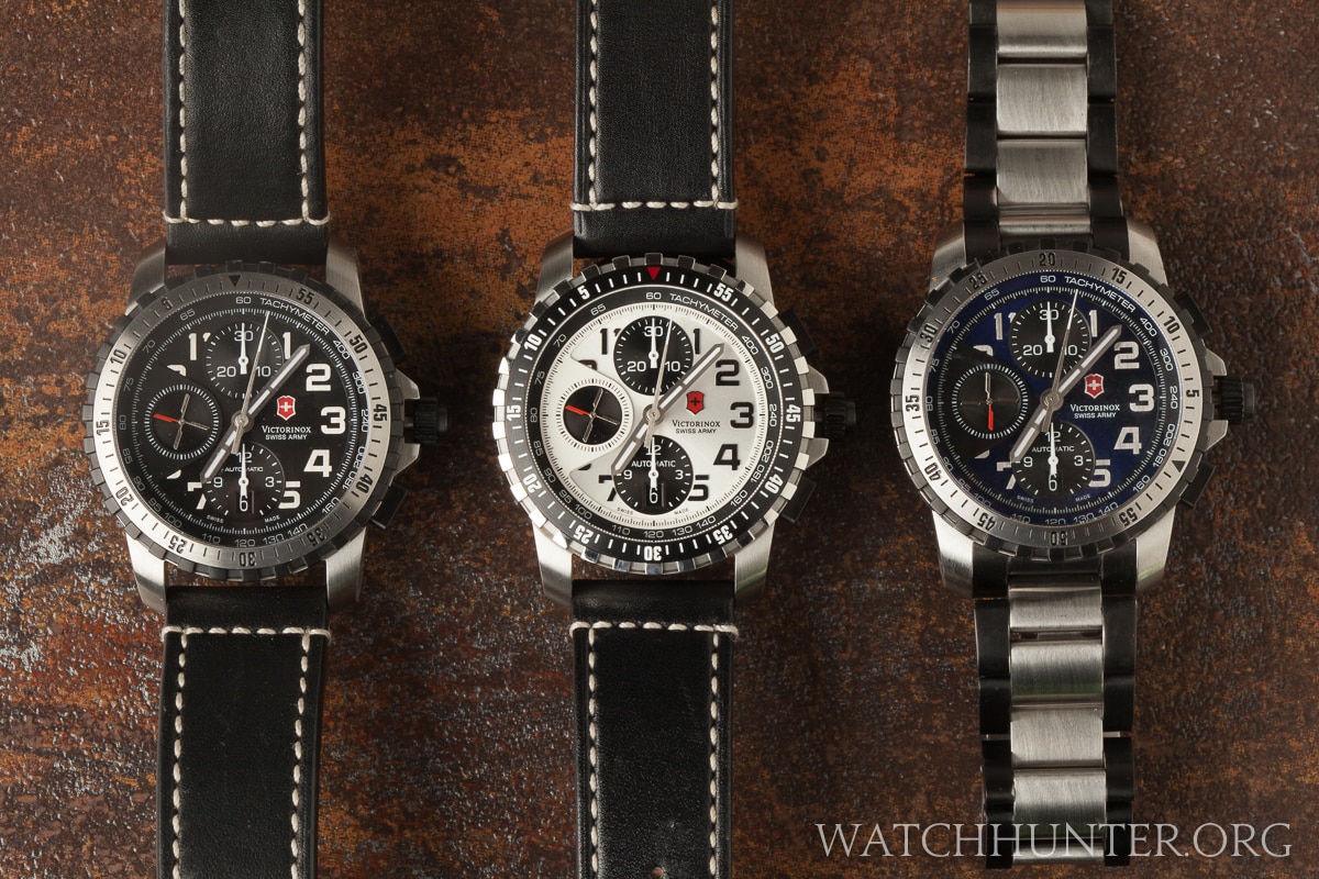
The main differences in the models are in the color of the dials, the countdown bezel finishing, tachymeter chapter-ring and watchband.
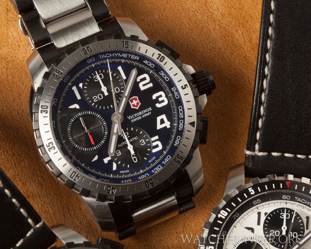
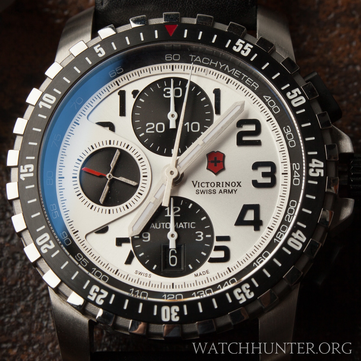
The blue and black models are most similar to the white one showing an arguably higher degree of finish. The white Alpnach’s bezel has white engraved text, a red pip at zero and alternating matte and polished finishes on the parapet-like outer bezel.
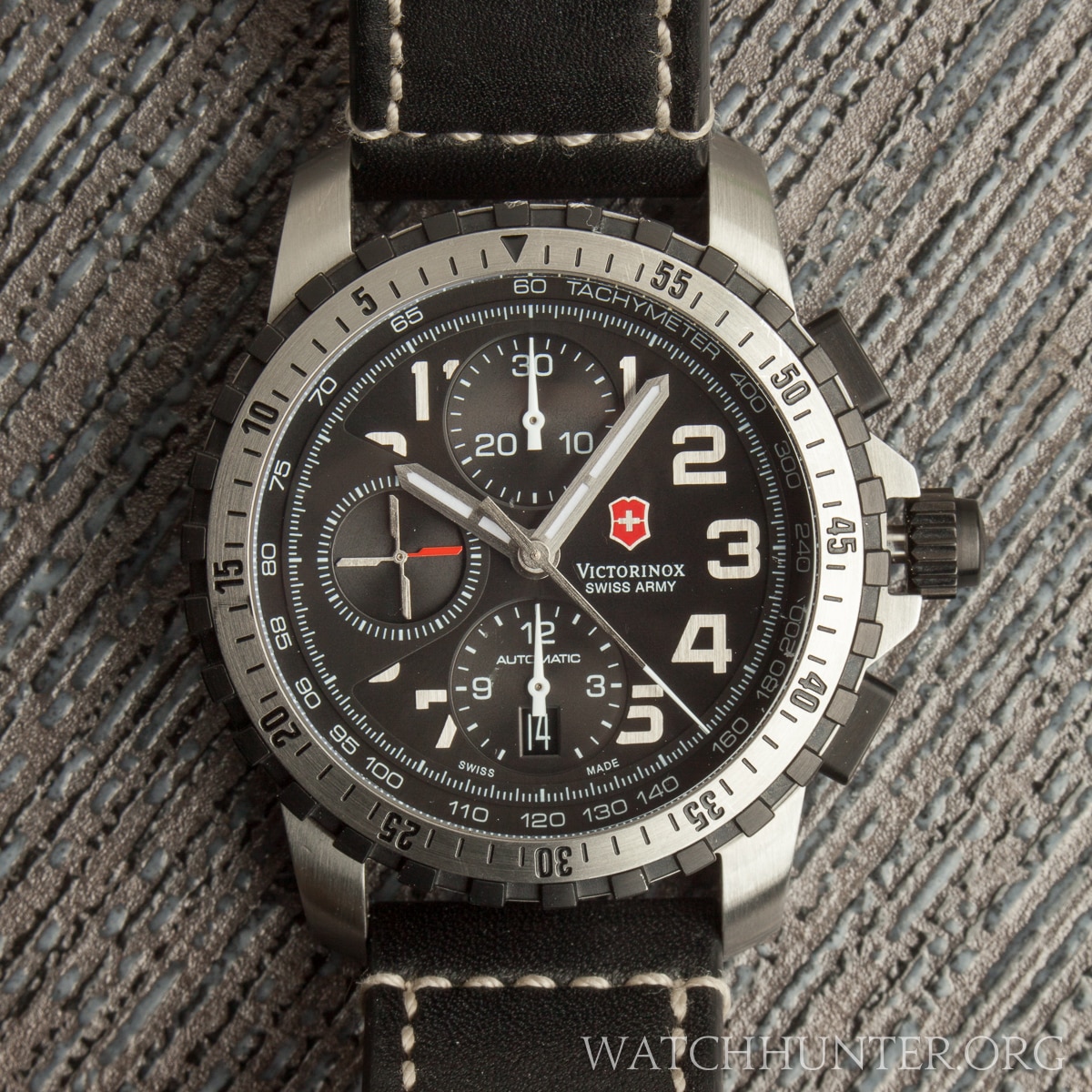
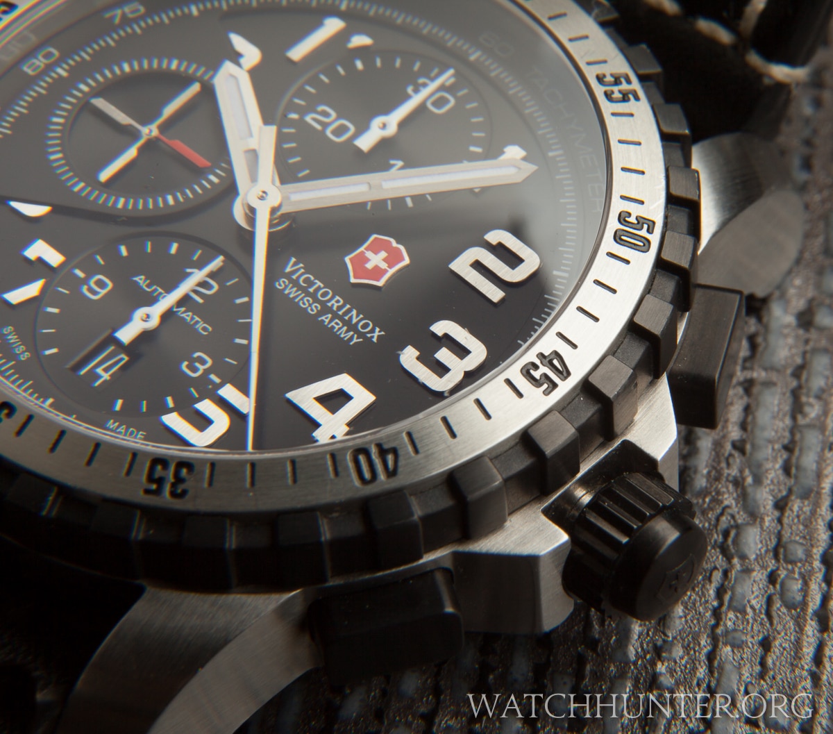
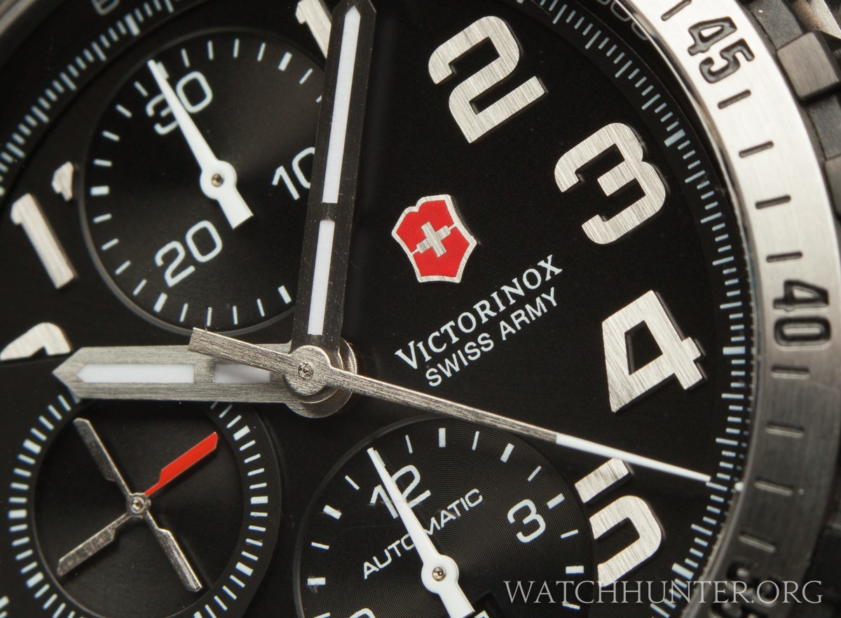
Zooming into the dial of the Swiss Army 241195, one can see the attention to detail with the applied polished steel and lumed numbers, the multi-level dial, and the masterful use of highly polished, brushed and matte finishes. Plus, black PVD was applied for contrast to great effect.
Bring a loupe when examining this watch and you will be rewarded with visual treats like the brushed steel hands and the dab of white on the chronograph needle.
If you are wondering why some people don’t like the dial then look below and count the numerals. There are only 4 complete large numbers on the dial. The rest are partially or fully obscured by subdials. This does not bother me one bit because I know where the numbers on a clock typically are. It gives the wearer just enough context to read the time at a glance. The subdials are replacements for the numbers at 12, 6 and 9.
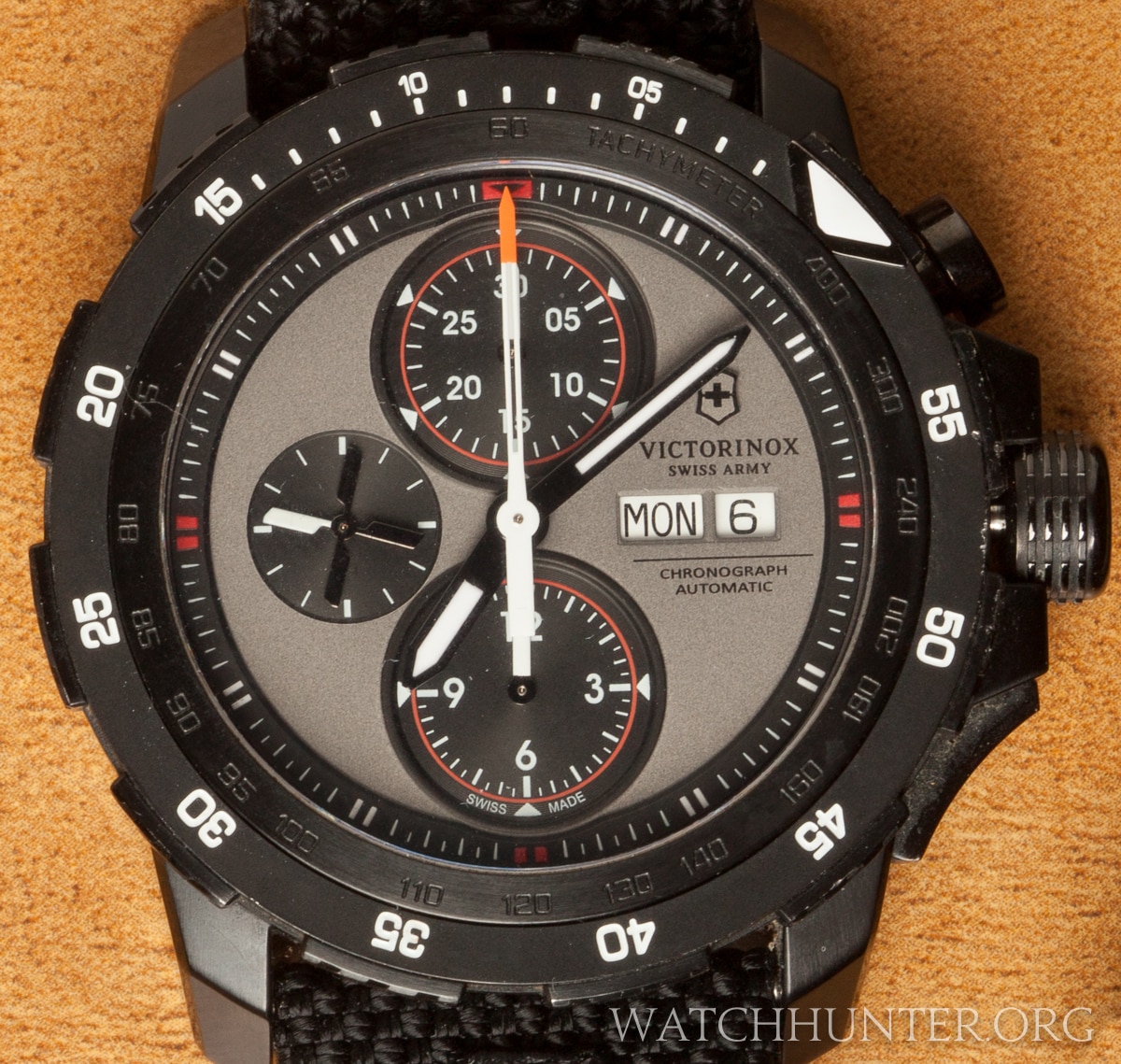
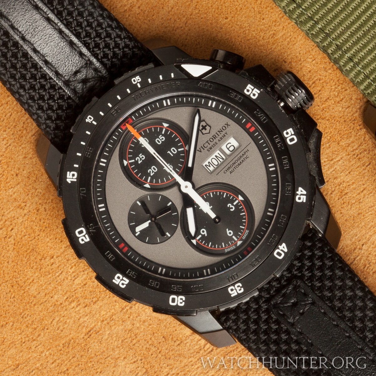
The second generation was redesigned to what I might call “monolithic”. This is a chunky beautiful watch that simplifies the dial by removing all numerals. That will teach us to complain about half numbers! The indices are simple line variations now. The subdial positions remain the same, but the date has been moved to a new spot and a “day of the week” has been added.
The countdown bezel mostly has numbers in 5-minute intervals and a larger pip. Look closely and you will see an engraved tachymeter scale. This is subtle and accessible when you want it, but does not make the dial overly busy. Just imagine if they had painted that scale. It might have ended up looking like a Citizen. Ouch!
My other favorite feature is the orange tip on the chronograph hand. The boring solution might have been to make it red like the other accents on the watch, but orange is more vibrant and will not blend into the red accents. I like the flat military gray and the Cordura watchband.
A curious feature of the 2nd generation is the designer’s choice to use an overly prominent chronograph center hand. This one is a thick white skeletonized dagger with a color tip. The counter weight is quite large as well and hangs deep into the subdial zones. Usually, chronograph hands take a back seat to the hours and minute hands, but not this one. It is quirky, but I like it.
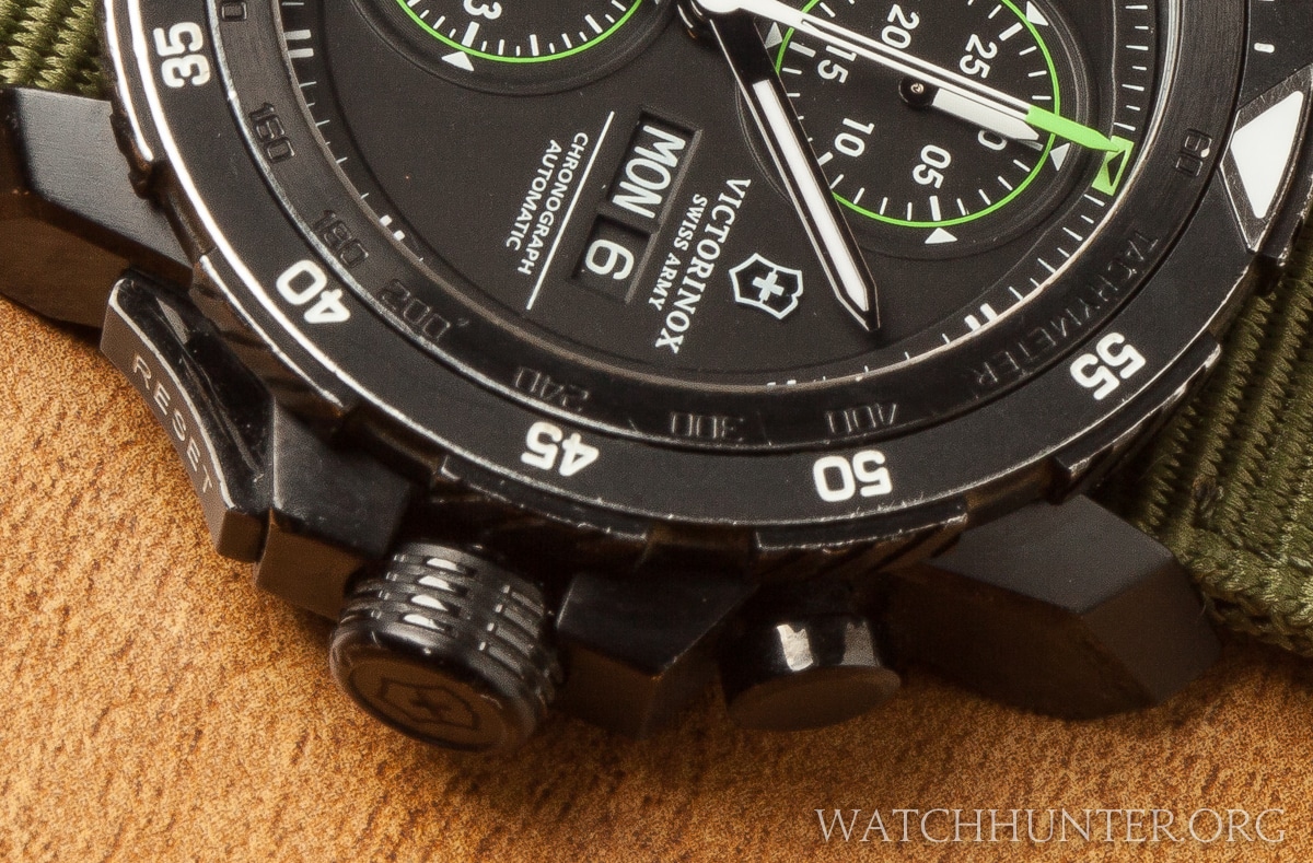
The normal pushers have been replaced with asymmetrical buttons. The start/stop pusher is a plunger and the reset but is more like a thumb pusher that literally reads RESET.
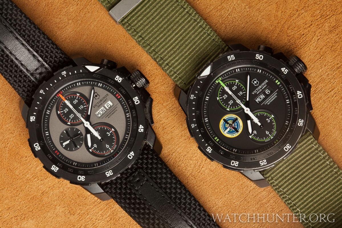
The stainless steel finishes of the first generation were replaced with blacked out PVD to give the watches a sinister black-ops feel. The watch will not get mistaken for a sporty dress watch. It pairs well with jeans, boots, button downs and the occasional flight suit.
The green accented watch with the U.S. presidential seal is a very rare and special version of the Alpnach first mentioned in the article “A Truly Presidential Special Edition Alpnach Watch by Victorinox Swiss Army“. I was able to acquire it from the seller who was an amazing person. It will get its own update story in a later blog. I am lucky to have it.
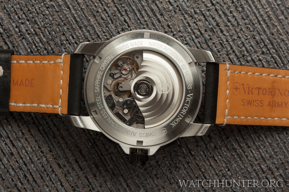
I almost forgot to compare the backs of both generations. The 1st gen. has your standard display back showing the workhorse ETA Valjoux 7750 movement. It looks like many other Swiss Army watches that are powered by the same movement.
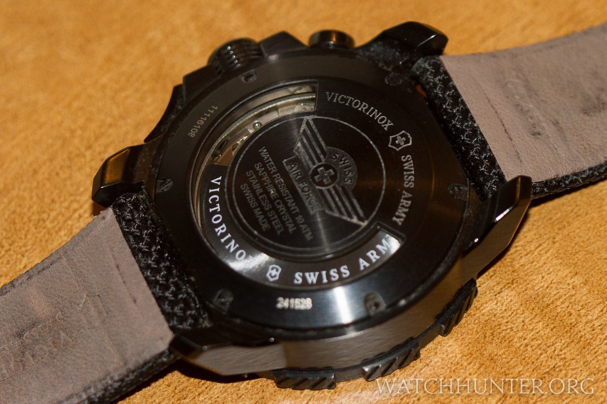
The 2nd gen. however, tries something new preferring to make the window look like one pulled off of a military armored vehicle. The beating heart of the movement cannot be viewed but the spinning rotor creates a strobe-like effect when in motion.
If you are still reading this article, then maybe the Alpnach series of watches has worked its way into the pleasure centers of your brain. Be careful, or you might end up with a squadron of your own.


Join the discussion One Comment